Why don't Publishers use Helvetica?

First appeared in The Guardian
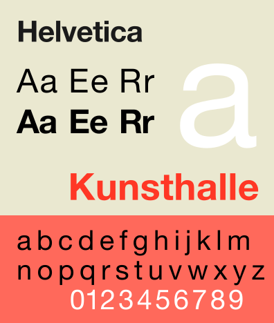
Helvetica's clear, transparent appearance would seem to make it ideal for books. So why is it used so infrequently?
I watched the documentary film 'Helvetica' last night. It illustrates how ubiquitously this typeface lives in our visual culture, and argues that typography plays a crucial role in conveying and influencing meaning. Wrong, I'd say, on both counts when it comes to books.
Clear, legible, and ordered, Helvetica was developed in 1957 at the Haas Foundry in Munchenstein, Switzerland. It gained immediate worldwide acceptance among typographers and designer folk. Today it's everywhere. All over London and New York, on storefronts, street signs, subways, planes and trains, income tax forms, postboxes and BMWs, print and television ads, billboards, letterhead, everywhere. And there are no half-measures: designers either love it or hate it. Gary Hustwit's artful film points this out, tracing the typeface back 50 years through a series of edgy interviews which skillfully summarize the rift that has raged in graphic design circles now for decades.
In one corner those who stand for typeface that is legible and unobtrusive, that doesn't interfere with communication of what the words mean; it's not about the notes, but about the space in between them. In the other, those who, like David Carson, former graphic designer of Ray Gun magazine, feel that "when they write "dog" it should bark"; who believe that just because something is legible doesn't mean it communicates. He heaps scorn on words written in Helvetica: "That doesn't say "caffeinated" - it just sits there. Nothing caffeinated about it." The film then fires passionately back and forth between designers who either hate or revere this unprepossessing little font.
All are agreed on one thing, however: Helvetica's dominating presence. This makes its absence in the world of books all the more intriguing. Of the 50-odd I checked on my shelves, only two were printed in serif-less, Helvetica-like type; both were art books, the rest contained typefaces identical or very close to Times New Roman.Helvetica may be everywhere - on the street, in the boardroom, around advertisements - but its nowhere on the bound printed page. It seems that serifed type has been deemed easier to read by the publishing industry than by advertisers and designers. Perhaps the serifs somehow aid in hurrying our eyes along the horizontal plane. Helvetica may be more legible at a distance, hence its use outdoors. Close up, serifs may help; further away, maybe not. Who knows?
Then there's the impact that typeface and layout have on the reading process itself. If you listen to designers, all tend to agree that it's significant. While this may be the case on the slippery sidewalks of advertising and design, in the pages of books I'm not so sure. For instance, last week I was in Montreal interviewing Neil Smith, author of Bang Crunch, an acclaimed collection of short stories. The ten page title piece is written without any paragraph breaks. Do you think I noticed? No. Neil had to point this out to me. Not only was I oblivious to typeface, I couldn't even see the absence of great big indentations. Perhaps this is a testament to the content and how absorbing it is, but my sense is that it has more to do with transparency.
Robert Bringhurst, in his elegantly written and designed book, The Elements of Typographic Style, calls typography a craft that clarifies, honours, shares, or knowingly disguises, the meanings of a text. "In a world rife with unsolicited messages, typography must often draw attention to itself before it will be read. Yet in order to be read, it must relinquish the attention it has drawn." Typography with anything to say, he continues, aspires to a kind of statuesque transparency, a creative non-interference. In a well made book the letters are legible and alive. They "dance in their seats." The typographer's essential task is to understand, interpret and communicate the text - its tone, tempo, logical structure, physical size - just as a theatrical director interprets a script, or a musician the score.
In short, Bringhurst says that typographers, like other artists and craftsmen, must as a rule do their work and disappear. This goal is largely achieved in the serifed, functional world of publishing. Ironically, in the wider world dominated by "clear, transparent" Helvetica, it is not. It is a fuzzy, egotistical universe that elevates the importance of appearance to the level of content in the task of conveying meaning.

